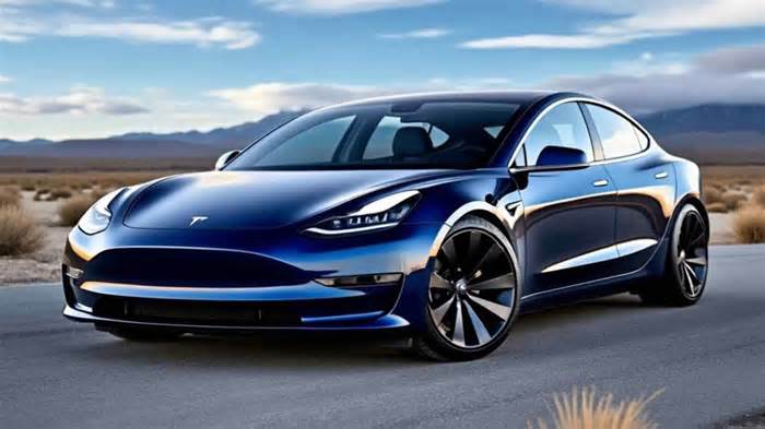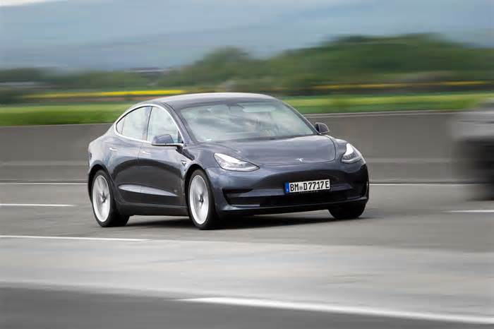
Tesla Model 3 review: new EV benchmark, or too clever for its own good?
- by T3
- May 26, 2024
- 0 Comments
- 0 Likes Flag 0 Of 5
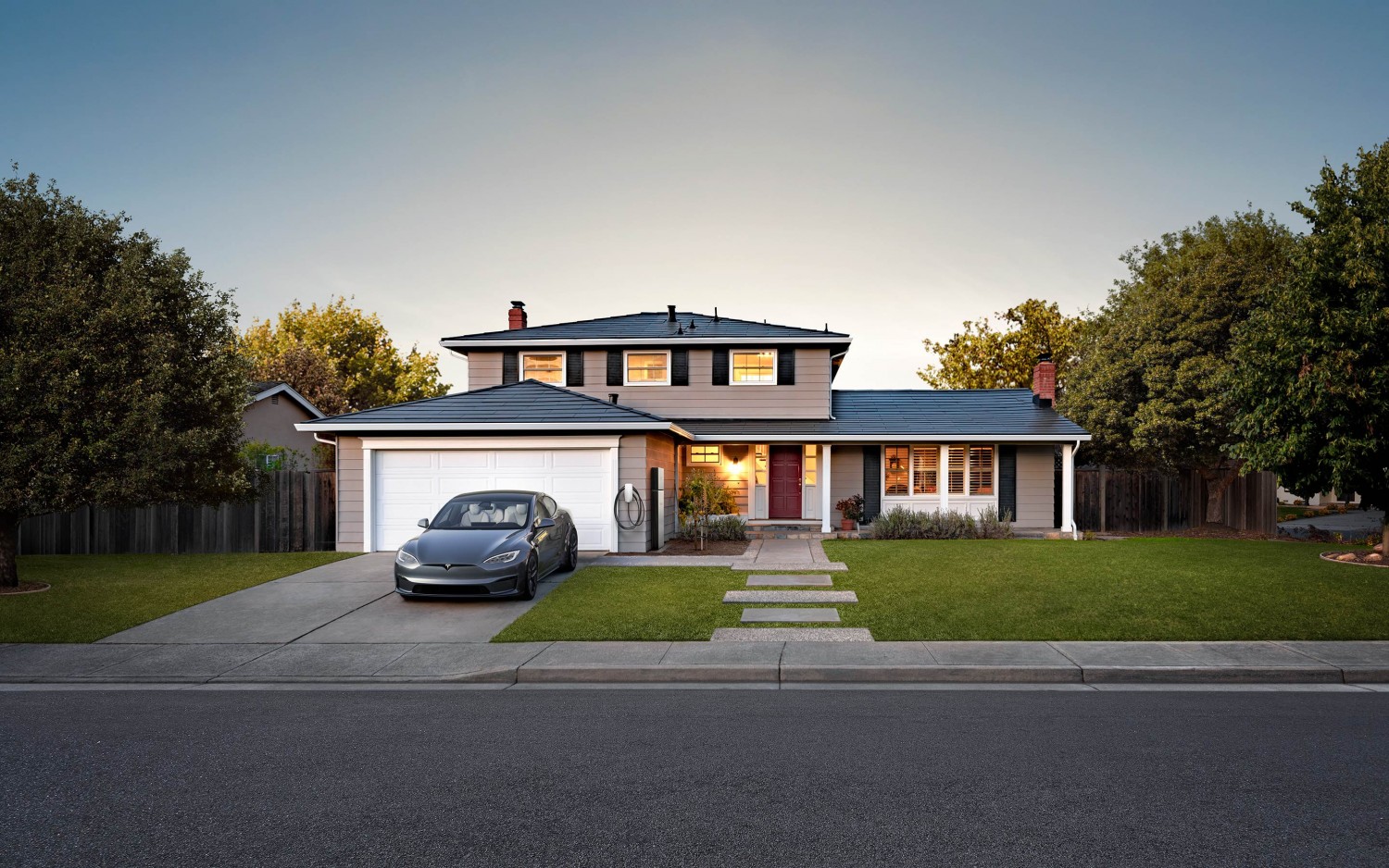
T3 Verdict
The 2024 Tesla Model 3 sports a subtle new look and more range, with improved refinement and an all-new interior. But removing the physical gear selector, as well as the indicator and wiper stalks, are hubristic steps in the wrong direction that spoil what is otherwise an excellent EV.
Reasons to buy (Image credit: Tesla)
Despite the minimalist aesthetics, the interior is full of premium features like a large panoramic glass roof, heated seats (which are also now cooled in the front row), acoustic glass for extra sound proofing, a pair of wireless phone chargers up front and two USB-C ports in the back.
Rear seat passengers also benefit from a new display, located low down between the front seats and used to adjust rear air temperature and seat heating. It can also access streaming services like Netflix and YouTube, and even play games, but doing that on the move is only recommended for those with a strong stomach. Parents, you’ve been warned.
Up front, there’s a big touchscreen that handles almost everything, from the music, navigation and air conditioning, to vehicle settings, charging and the speedometer. It’s where you need to go to adjust the position of the mirrors and steering wheel, and even where the gear selector, headlight and wiper controls live.
And this, unfortunately, is where the annoyances begin. The door mirrors cannot be adjusted without going into the touchscreen system, and nor can the windscreen wiper or headlight settings. A button on the steering wheel performs one windscreen wipe with a press, and washes with a long press; either of these temporarily shows more wiper controls on a lower corner of the touchscreen, but the small icons can be tricky to tap accurately while driving.
(Image credit: Tesla)
There’s an automatic mode, but since that’s so unreliable – a common Tesla shortfall that has lingered for years – I recommend you avoid it. The windscreen would frequently be covered in rain, to the point of being dangerous, without the wipers noticing. They also often failed to register how heavily it was raining, and would sometimes come on for no reason at all. I know this is remedied with a press of a button and a tap of the screen, but asking the driver to take their eyes off the road when the automatic wipers have failed them is absurd. What's wrong with a stalk?
I’m left wondering how we are supposed to believe Tesla’s plans for fully autonomous vehicles when it can’t even get automatic wipers right.
Equally baffling are the indicators. Again, instead of fitting a stalk-like everyone else, Tesla asks Model 3 drivers to indicate with a pair of haptic buttons on the wheel, below their left thumb.
This is just about acceptable when changing lanes on the motorway, and to their credit, the indicators handily switch off when the car sees you have completed the manoeuvre. But when navigating a tight roundabout it’s practically impossible to press the correct button without looking.
Ferrari was also criticised when it deleted indicator stalks back in 2010, but it at least had the common sense to put a button on either side of the wheel, and because the steering is so quick you rarely need to steer hand-over-hand, as you do in the Tesla.
Even the gear selector is on the touchscreen. Mercifully, this actually works well and is more intuitive than you’d expect; there’s a slim, permanent line on the edge of the screen closest to the driver, on which you swipe upwards to select Drive and downwards for Reverse. There are also icons to tap for Park and Neutral. This works, but Tesla would rather you let the car change gear automatically, since it’ll go for Drive when backed up against a wall, or Reverse when there’s something in front. This isn’t as annoying as it sounds, but good luck figuring it all out without a demonstration first.
(Image credit: Tesla)
There’s even a third way to change gear, with a set of standard P, R, N, D buttons in the headlining behind the windscreen, along with a button for the hazard warning lights. Although when I say “button”, I actually mean a touch-sensitive icon that doesn’t move. This makes it difficult to give a quick blink of the hazards – something I do frequently to thank or apologise in city traffic – without looking up to check it's worked.
Removing switchgear like this screams “cost-saving” and delivers no benefit to the driver. Unless the 2024 Model 3 is the only car you’ve ever driven, flicking the indicator stalk with an outstretched finger is as instinctive as reaching for the seatbelt or checking your blindspot. Pressing a button isn’t simpler, quicker or easier, because there was zero hardship in the first place. All it does is add confusion and complexity – and the safety regular Euro NCAP agrees. New rules arriving in January 2026 will dock safety points from cars that do not have proper, physical switchgear for indicators, hazard warning lights and wipers.
(Image credit: Future)
Lastly for the negatives – I appreciate this is starting to sound like a rant – is how the central display shows a virtual representation of what the car can see of its surroundings. This is primarily intended to show what’s going on when the Autopilot driver assistance system is activated, but remains in place when the system is switched off. Sometimes it cleverly shows nearby cyclists, trucks, pedestrians and other hazards, but it isn’t always reliable. Cars sometimes dance around the screen despite being stationary (another years-old fault), and sometimes pedestrians turn into cyclists, while trains and trams appear as especially long trucks.
These virtual objects turn red when the car thinks a collision is imminent, and the driver is audibly warned. The latter isn’t unusual for modern cars, and these systems sometimes make mistakes. But in my experience, the Model 3 makes more mistakes than most. The system had a habit of warning me about pedestrians walking safely on the pavement, well away from the road, and panicking when driving around parked vehicles. Yet, when a moped rider fired out into the road from between two parked cars, causing me to stop, the Tesla didn’t see a thing.
(Image credit: Future)
In better news, the smartphone app is fantastic. It’s easy to set up, fast to use and reliable. Although not unique to Tesla, it works better than any other connected car app I've used.
I loved being able to remotely check on the charge status or turn on the air conditioning before driving on a warm day, and your phone can be used as the key; just walk up to the car with your phone in your pocket, get in and go – then just park, get out and walk away. It's seamless.
Should I buy the Tesla Model 3?
(Image credit: Tesla)
Coming to a definitive conclusion on this car isn't easy. The Model 3 gets so much right – the charge network, the phone app, the excellent efficiency and great range – then fails on aspects that shouldn’t even be up for debate.
When did you last hear of a car being criticised for its indicators, wipers or gear selector? You don’t, because everyone else uses broadly the same standard controls, which are the result of decades of development and refinement. Indicator and wiper stalks did not need reinventing, in the same way no one asks for redesigned seatbelts or for six wheels instead of four.
When given a clean canvas to work from – such as with a charge network and a phone app – Tesla absolutely nails the objective. It produces the gold standard to which everyone else is compared, and for that it should be highly commended.
But when faced with decades-old tech, like indicator and wiper stalks, it just can’t help itself. To change these controls and force customers to relearn the hardwired fundamentals of driving a car is arrogant.
(Image credit: Tesla)
Sometimes this attitude is respected, even revered; akin to Henry Ford or Steve Jobs insisting they know what the customer wants before they realise it themselves. But this isn’t one of those moments. These are cost-saving changes with no obvious benefit to the customer.
The result is a car that somehow manages to hit the bullseye and miss the mark by equal measure. By almost every metric, the new Model 3 is among the very best EVs you can buy today, with top-notch technical abilities and a very real sense it could be the perfect car for almost everyone. It’s also keenly priced, nicely designed and packed with fun, useful tech. I just wish Tesla would stop with the hubris and reinstate the physical controls of the old Model 3. If it did that, I’d probably buy one. For now, the frustrations caused by Tesla's meddling with the fundamentals are too much to ignore.
Today's best EV Chargers deals
$599
Please first to comment
Related Post
Stay Connected
Tweets by elonmuskTo get the latest tweets please make sure you are logged in on X on this browser.
Sponsored
Popular Post
Middle-Aged Dentist Bought a Tesla Cybertruck, Now He Gets All the Attention He Wanted
32 ViewsNov 23 ,2024
Tesla: Buy This Dip, Energy Growth And Margin Recovery Are Vastly Underappreciated
28 ViewsJul 29 ,2024


 Energy

